DigitalRamen ThemePark Tutorial
Thursday, 11 October 2007
Page 11 of 12
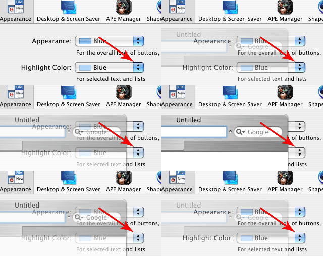
Part 2 - inactive and clear states explainedIn 4.1 I told you to skip over the Caps - Clear resource within the Large Push Buttons section. The reason for that is that Clear states are not another appearance, like Blue or Graphite, but rather a method of feedback based on functionality. Here's how Jason Harris, the creator of ThemePark, describes the Clear state: "If you're running Aqua and Blue is set as the color variant in System Prefs - > Appearance and the System Prefs window is frontmost, the Blue popup menu will have a blue arrow on the right side. If you bring a Safari window frontmost, but can still see the System Prefs window, the popup menu's arrow will change to the Clear variant, indicating that if you click on it, it will pop open immediately, instead of requiring one click to bring the System Prefs window forward and then a second click to popup the menu. "If, on the other hand, that popup menu was designed so that you did need to click on it once to make the System Prefs window frontmost and then a second time to pop open the menu, the menu would have shown the Aqua disabled state instead of the clear state. Or, depending on how it had been coded, it might have just shown the standard blue state instead when it wasn't the front-most window." 
To make matters worse, the inactive state is generally only used in Carbon applications, while the Clear state is exclusive to Cocoa apps. To be safe most themers make the Blue and Clear elements look the same, while the thorough test each element's clear state to see how well it works. The best advice I can give you regarding clear states is to wait until you're comfortable in ThemePark before trying to figure them out and use them to their full potential, which is a tricky business regardless of theming experience. |
Search |
