Unified Toolbars and Sucky Themability
Wednesday, 13 September 2006
Windows with a unified toolbar are not very nice to theme, unfortunately. In fact, the phrase "<expletive> brain dead" comes to mind. The brief synopsis is that you should probably just not try to theme them. If you leave 'em unthemed, ShapeShifter (as of version 2.4b4) will automatically use the title and toolbar of a metal window for you, while still giving you the drag-by-toolbar functionality that distinguishes the unified toolbar. This is almost certainly what you wanted anyway. But if you insist on being masochistic, continue on… There are three resources that control the appearance of the unified toolbar. In ThemePark, these are located at:
When the window is frontmost, the two UnifiedBackground resources are used. Otherwise, the titlebar and toolbar are tiled with Window Background. Right off the bat, that's annoying to theme — filling the titlebar and toolbar with the pattern that you intended for the background of the window content is nasty. Also, both of the UnifiedBackground elements contain two different states. You'd assume (if you were possessed of that "sanity" thang) that the first is for the active window, while the second is for the inactive. Nope. In almost all cases, only the first state is used. The second is used only when the Unified window is frontmost, but there is a modal dialog in front of it, as seen in the picture below.
But it gets worse. You may have noticed that the resource titled Short is 80 pixels tall, while the element titled Tall is 62 pixels, well, short. Yeah, I don't know either… Moving on to the actual implementation, the two images are composited on top of each other with varying degrees of transparency in order to form the unified background. Here's how it all works:
Yeah, I'm not sure what the rationale behind this weird implementation is, either. But it gets worse. These UnifiedBackground elements are stretched rather than tiled. This implies two things right off the bat - if you want the titlebar portion or your titlebar-toolbar combo to always look a particular way, you're screwed - if the user changes the toolbar size to small icons rather than the large icons you were using when you designed things, all of a sudden, she'll have a squashed looking titlebar. Yucky. This also means that you're pretty much limited to using a solid color horizontally, since this 8-pixel wide image gets stretched all the way across the window including inside of the left and right caps. So basically, your theme can duplicate Apple's implementation of unified, and that's about all you can realistically do. Here are a few screenshots showing how this all works.
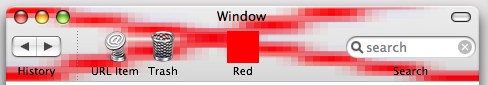 Large Icon with Text
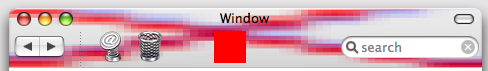 Large Icon Only
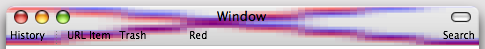 Small Text Only
So, yeah, leave these unthemed and let ShapeShifter do the work for you. |
SearchLatest Musings
Syndication


|